Landscape photography composition:
The best tips
While correct exposure and pin-sharp focus are often taken for granted, it is arguably the composition of your photographs that defines and distinguishes your style and attracts your viewers – or drives them away. Unfortunately, there are no golden rules for "getting it right". You'll have to follow your eye and your instinct to transmit your impressions of a scene to those who missed it.
You may want to rotate your phone in order to improve your browsing experience on this site.
Quick links
What photography composition is about
If in doubt, consult a dictionary. Composition is, among other things,
- "the organization or grouping of the different parts of a work of art so as to achieve a unified whole" (dictionary.com)
- "the harmonious arrangement of the parts of a work of art in relation to each other and to the whole" (Collins Digital Edition)
The human eye is a magical instrument. It constantly – and instantly – adjusts to changing lighting conditions and presents the reality in such a way that makes it easy for us to comprehend.
When taking in a wide landscape, it will even the high contrast and blend distracting details out. What we sense might seem perfect but it isn't necessarily exactly real.
Taking a picture of this landscape with your camera is a different story. The camera is no flatterer, and the digital one even less so. It is designed — and we naturally expect it — to deliver a carbon copy image of the reality before our eyes.
If not instructed otherwise, it will capture the actual contrast of the original scene and try to put everything in focus. If this weren't bad enough, the resulting image will inevitably squeeze the expansive vista into a tiny frame.
It is what you include in this frame that presents an observer with the view she didn't enjoy with her own eyes.
Photography composition is the art of choosing and organizing this frame.
Composing an image is like retelling a book to a friend. When doing so, you'd probably concentrate on important characters and features, and leave negligible details out.
The same approach applies to photography. It's a good idea to consider what belongs into your story / picture, and what wouldn't fit there. The best way is attempting it beforehand, prior to pressing the shutter release.
The only thing you can — and eventually should — change afterwards, in post-processing, is the exact frame. Cropping your image is the last action you can take to improve its composition. The rest has to be done on location.
Composing your images
Use prime (fixed-focal-length, as opposed to zoom) lenses. Why is that? In my opinion, there are several reasons.
- Taking images with the same focal length makes you used to it. Soon you'll know what's inside your frame without the need to hold the camera to your eye.
- A prime lens makes you disciplined. Limited in choice of your frame, you'll have to spend more time finding your exact position, aka zooming with your feet.
While seemingly unproductive, this extra time will allow you to give more thought to your image. And of course, in the end it will lead you to the best standing point to press the shutter. - Prime lenses are often faster and of overall higher quality than zoom lenses.
Though this won't affect your composition efforts, knowing that you are using quality gear will let you concentrate on the details of your image rather than shortcomings of your equipment.
As a landscape photographer, you don't have to cover all focal lengths. A 24mm / 28mm / 35mm full-format equivalent lens (that's 16-23mm for APS-C size sensors, or 12-18mm for the Four Thirds systems) accompanied by a standard 50mm (33mm in APS-C size terms, 25mm Four Thirds) should suffice for most situations.
You might also add a short telephoto lens of, say, 85mm (55mm APS-C, 42mm Four Thirds) for occasional portraits during your travels.
With my camera, I only use two lenses, 45mm and 90mm, which have the equivalent field of view of 25mm and 50mm lenses, respectively, in panoramic format.
Not that I were spoiled for choice, though. There is just another single option in existence, a 30mm f/5.6, which has a panoramic field of view of a 17mm full-frame lens.
Use your eyes. Don't look only through the viewfinder or on the display of your camera when framing. Seeing what's around your envisaged scene is important.
If you need assistance, cut an "analogue" frame with the aspect ratio of your camera sensor (e.g., 3:2 or 4:3) out of cardboard. Make it as big as to cover your lens's field of view when holding it at your arm's length before your eyes.
Don't hurry. Spend some time with the scene actually looking at it before making the click. Ask yourself what you feel, and what you'd like to share about this feeling with your viewers.
Place your subject. Think about what you want to focus on in your image and position it in the frame. The general advice on the topic suggests that you should follow the rule of thirds when looking for where to put your motif.
The rule is a simple guideline to divide the sides of your frame in three equal parts, and to position points of interest in your image, like the horizon or the main subject, along the division lines. The four intersection points of these partitions are regarded as particularly strong visual marks.
To assist you in this task, many a modern camera will superimpose a grid of reference lines on its display or in its viewfinder. (My camera won't.)
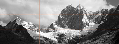 Jirishancas • Cordillera Huayhuash, Peru
Reference lines for the rule of thirds applied to a mountain view
Remember though that this is just a rule of thumb to use as an approximation and not to follow blindly. Use your judgement.
Historically, pleasing to the eye relation of 2:1, voiced for the first time in the end of 18th century, probably was a mere simplification of the golden ratio known to – and meticulously followed by – the old masters since the Middle Age.
The rule postulated that when dividing something in 2 unequal parts, the relation of the whole to the bigger part should be the same as that of the bigger part to its smaller sibling.
E.g., if a line were to be divided in 2 parts of length, say, a and b, with a being the bigger of the two, then the following equation should hold for the golden ratio: (a + b) / a = a / b.
This rather simple equation has a solution approximately equal to 1.618 for the sought-after relation, or 0.618 and 0.382 for the respective parts' dimensions relative to the whole. This is, indeed, close enough to 2:1 (0.67 and 0.33) suggested by the rule of thirds, though 5:3 (0.625 and 0.375) would have been even (much) better, if not very practicable. To the first pass • Cordillera Huayhuash, Peru
Mountain landscape composed according to the golden ratio
Make some room. Space surrounding your subject, or subjects, is an integral part of the image showing how its components relate to each other and their environment.
In visual arts, the concept is referred to as negative space, as opposed to positive space claimed by the subject. The very meaning of the negative space is to accentuate the subject.
Neutral backgrounds and out of focus elements count as negative space, while distractions don't. The latter impair the valuable positive space of your image diminishing its overall appeal.
The related rule of space suggests reserving enough room ahead of moving subjects to visually facilitate their further progressing. The rule actually applies as well to resting subjects capable of moving, and even flags fluttering in the wind.
Placing a ship, for example, with the bow against the edge of your frame is probably not a very good idea. Again, as with any rule, use your judgement.
“There are no rules for good photographs, there are only good photographs.”
Ansel Adams
Look for lines, shapes, and patterns. Repeating elements, textures, and geometrical forms add structure and interest to your image.
Treat colour as subject. There are (rare) occasions when colour alone might work as your main motif, rows of vividly painted beach houses being a popular example. This tends to result in somewhat abstract images.
Getting it right is tricky but very satisfying. I don't succeed very often.
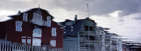
Try an unusual angle. With growing confidence in your composition skills, break some rules! Place your subject in dead centre. Tilt the horizon. Turn reflections upside down.
Think of something unexpected. Surprise your viewers!
Balance your image. A bold subject placed in a prominent spot of the frame is a strong visual message… which can topple your image. Try to counterbalance big and heavy forms and features with smaller and lighter details. Clouds and reflections are good examples of such details.
Arrange your fore- and background. These should complement — and compliment — your main subject, not work against it. If some details in front of and/or behind your subject are distracting, you might consider opening up the aperture to reduce depth of field in the image and throw disturbances out of focus.
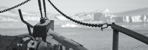 Ahead • Ilulissat Icefjord, West Greenland
Concentrating on the foreground with shallow depth of field
Tidy up the edges. It is a good idea to search the edges of the frame for visual noise before pressing the shutter release. Sure enough, you can crop the image in post-processing — and sometimes you really should — but it's better to spend another moment or two checking for branches sticking out of nowhere, or people halved in two by the sides of your frame.
Besides, this is a great opportunity to improve your image by ensuring some lines start or end near its corners. In the resulting picture, these lines will ideally lead the eye of the viewer to the main subject making it instantly obvious what the image is about.
Training your photography composition skills
Practise. Go outside and shoot! There's no theory to rack your brain about, just do it.
Ask your viewers. As with everything else, an honest feedback will tell you how you manage. Don't be afraid to show your images and let comment on them. Internet forums are good places to see and be seen. Just avoid those where trolls are in the majority.
Learn from someone you consider good. If you like someone else's images, try to analyse them. What do you like about them? What impression do they make on you? How did the author achieve this?
Try to imitate some of your favourites. Compare your results with the originals. Do your images have the same effect? How would you change them to make them look different – taken by you? Experiment with your ideas.
Learn from other art forms. Don't limit yourself to studying only photographs. Photography isn't the only visual art form to use composition as a means of expression. Painting long before it and cinematography as its successor have both been exploring the same principles.
Visit an art museum, or a gallery. Compare styles of different artists in different ages.
When going to the movies next time, pay attention to how the landscape is pictured, and how its presentation affects your emotions. (You'd probably want to opt for an "arty" film instead of your typical summer blockbuster.)
Tags: #photographycomposition #betterphotography #phototips
Other tutorial topics
- Brief history of photography
- History of photography, from the early beginnings to the present day.
- Camera exposure and its elements
- Understanding camera exposure principles and settings, including exposure compensation and bracketing.
Other photography tips
- Landscape photography composition tips
- Your mastery of photography composition is what ultimately makes your images. Read here how to excel at it in order to engage your viewers!
- Black & white landscape photography
- Black-and-white photography is very much alive, and landscapes in black and white still look as stunning as in Ansel Adams's day. Be sure to check the article if you'd like to try your hand at this classic and fascinating technique.
- Landscape photography equipment essentials
- Looking for a new camera or another piece of gear? Find answers to your questions, along with some advice and recommendations!
- Fine art photography prints
- And now for something completely different… My thoughts and advice on choosing and using fine art photography prints.
- How to photograph waterfalls
- If your waterfall images are not up to the expectations of your friends, nor to your own satisfaction, try these easy to follow tips to make them shine!
- Marketing fine art photography
- This newsletter issue is about creating your brand and marketing your work, told by those who've been there and done exactly that.
- What is legal to photograph outdoors
- Ever thought about copyright laws having two sides? Your photography can violate them, too. Be sure to know what to photograph, where without getting into trouble.
- How to use Photoshop
- In a dedicated newsletter issue, join me as I show how I use Photoshop to edit my images, and learn some funny facts about the application while at it.
- Wildlife photography tips
- No purchase necessary: Learn how to photograph wildlife for best possible results with your usual equipment.
- Art seascapes
- As November closes in, we take Ishmael's, of Moby Dick, advice and get to sea as soon as we can, led by some highly inspirational examples.
- Winter landscape photography tips
- "Winter landscape" may not sound as exciting as, say, "summer beach", not to everybody, for sure. But if it does to you, there is much to discover outdoors in this time of the year, too. Dress warmly and come on outside!
- Best Adobe Photoshop tips
- We recall some Photoshop basics, like layers, and proceed with more advanced topics, like masks, selective channel editing, converting colour to black and white, and output sharpening.
Tell me what you think!
Is it useful 👍? Awful 👎? Leave a message! Your comments help make this site better (and give me a kick—one way or another).
Popular articles
-
A kind of magic
If a digital picture has to be seen in the real world, printed on a real medium and displayed in a real showcase, its transition from RAW to real is better done in an old school image editor. Enter A…
-
A duck for a dog
If you got your own place on the Internet, helping your visitors find what they are looking for is a great way to engage them and keep them staying a bit longer. A custom site search can achieve just …
-
"Might as well have the best"
Aiming for better images? Think better lenses! This is your most important piece of gear, so you better get it sorted out. — Need some advice?
 Become a patron for